top of page

Japan website launch
Project Overview
Our company launched their services in Japan along with a new way of trading using a subscription model.
For the launch, we needed to create a website that educated users about this new way of trading using a subscription.
Role
I led this project with another UI/UX designer. The task was to create a website that aligned with Japanese website design with a blend of modern design. There had to be a balance so the site could still feel local to the Japanese users.
Additionally, we needed our website to introduce and educate individuals on the subscription model as it is a new concept that individuals may not be familiar with.
Challenge
Since Japanese website design is very different from Western web design, the challenge was identifying the balance between the localness and familiarity of Japanese traditional website design while still allowing for modern elements.
Tools
Sketch
Miro
Forms
Excel
Roles
UX researcher
UI/UX designer
Platform
Responsive website
Company
ThinkMarkets
Industry
Fintech
Team
• Myself (UI/UX designer)
• Vera Huang (UI/UX designer)
• Erik (Creative designer)
• Chloe (Content)
• Developers (Alireza, Nick, Ozge, John)
Design Process
Research
• Competitive analysis
• User surveys
• Qualitative research (familiarize ourselves with Japan culture and the design trends)
Content
• Updated copy
• Translations
Design
• Lo-Fi
• Hi-Fi
Branding
• Copy updates
• Creative assets
Feedback
• Stakeholder review
• Japan office review
Handoffs
• Upload designs to dev
• Update tickets to keep track of project progress
• QA in staging environment

Competitor Analysis
Main competitors


Layout
1 Information tends to be assembled in boxes/cards/tables
2 Little white space
3 Dense sections of text
4 Greater amounts of text and detailed info up front
UI analysis

Google Translated
News


Visuals
1 Smaller and more frequent graphics
2 Mascots/character usage
3 Infographics/visual storytelling of how something works
4 Women are portrayed more than men


Colors
1 Several contrasting colors and design elements are often used within small spaces
2 Red is a primary color for Account opening CTAs
3 Bright, bold colors


UX analysis
Hompepage
• Clickable carousel banners that take users to the designated page
• We noticed a pattern of specific information that would always be shown on homepages. For instance, they used many links on their home pages. Market news was always presented on the homepages and always shown in a list link format


Create Account
• On most Western trading websites a Create Account button will lead users directly to a sign-up flow.
However, for Japanese websites, the Create Account button leads users to another page with more detailed information on how to sign up, the process, what you will need for the process FAQs, etc.
Then from this Account creation informational page, the “Apply” buttons will take users to a sign-up form/flow


Side menus
• On all the internal pages and homepages, there is a heavy side menu usage
• Side menus are very lengthy
Advertisements
• Multiple Stickers/advertisements are under the side menu and are clickable that lead to other pages


Other Japanese design trends from trading websites
We had an in depth analysis on branding elements across 10 different websites. Here l am showcasing part of the comparison table
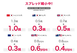
Emphasize "FREE"
Large numbers to showcase spreads
Sign up Steps


Survey
Overview
Japan users are not very trusting of non-local companies. They tend to do a lot of reading before making a decision.
Because of this, we wanted our website to be very informational. We wanted to align our website with Japanese web design such as the structure and the look and feel. By doing this, the website will feel more local and familiar and in return will help users trust our company more.
Purpose of the survey
This survey aimed at gaining a clearer understanding of the branding approach we intended to pursue. We created a survey so we could hear from some Japanese citizens themselves.
About the Survey
The survey was kept relatively short with a combination of multiple choice and short answer responses. View our survey below
We broke the survey up into 3 parts:
1. Personal information
We asked the user about themselves such as age, gender etc
2. Website design preference
This section included questions about what catches their eye on a website
3. Website style comparison
We showcased 3 different Japanese website homepages shown below and asked questions regarding the 3 options presented
01 Traditional
Traditional Japan design
(dense, busy, a lot of different focus points)

02 Modern
Modern Western design
(modern, big visuals, strong headers, short & concise information)

03 Blend
A blend of 01 and 02
(Cleaner visual design more organized content)

Our findings
An almost unanimous response where the individuals favored website number 3 (blend). From this, we gathered that they still need heavier information but prefer an organized and cleaner layout.
Despite most of our competitors embracing the traditional Japanese website designs, we chose to integrate Western and Japanese design elements when creating our website.
Sitemap

Low-fi screens


Branding
I created moodboards showcasing differentiating styles. From there, I transitioned to creating style tiles to further discern what visual elements would complement each moodboard.
Branding elements
• Bright eye-catching colors
• Overlaying /overlapping of different elements
• Inviting over serious
• We used many images of people, mostly females
Reasoning for this: Targeting the “Mrs. Watanabe” traders

Homepage
4 reasons to trade with ThinkMarkets
Forex Trading risks
Subscription page
Account Creation
ThinkTrader
bottom of page