top of page

ThinkMarkets website redesign
Project Overview
ThinkMarkets is a multi-asset, brokerage firm providing traders access to a wide range of markets. ThinkMarkets is an international company with hubs all around the world and offers a wide range of trading tools and services to meet the needs of all traders.
Reason for a redesign of the marketing website:
The website was very outdated. The visuals and components were not up to date with the trends. The navigation was not user-friendly. User journeys were confusing and misleading.
Goals for the website:
• Modern visual design
• Increase visual hierarchy
• Improve the user journeys for a more pleasant user experience
• Improve story telling of pages
Tools
Figma
Miro
Forms
Excel
Roles
UX researcher
UI/UX designer
Platform
Responsive website
Company
ThinkMarkets
Industry
Fintech
Solution
To properly redesign our website, we needed to do a deep dive into the structure of the website to fix navigation issues. It was important for us to figure out the correct content needed for each page based on our users. Additionally, a full visual overhaul was essential to adhere to a more improved visual design
Team
• Myself (UI/UX designer)
• Vera Huang (Senior UI/UX designer)
• Patricia Gorgi (UI/UX designer)
• Creative designer
• Content team
• Developers
• CMO
Design Process
01
Research
• Competitive analysis
• User research
• Article research
• Card sorting
• Clickstream analysis
• Survey
02
Design
• Crazy 8’s
• Lo-fis
03
Feedback
04
Content
• Lo-fi wireframe feedback and approval
• Receiving copy from the content team
05
Branding
• Receiving new brand with creative assets
06
Design
• Hi-fis
(Implementing copy and branding into our wireframes)
07
Feedback
• Stakeholder review and approval on final screens
08
Handoffs
• Upload designs to dev

Survey
We created a survey to get a better understanding of what our stakeholders were looking for with the new website redesign
How we analyzed the data from our survey:
01 Extract
We extracted ideas and keywords from the answers regardless of questions asked
02 Categorize
We categorized relevant ideas and keywords into different groups
03 Theme
We gave a theme to best describe each group

.png)
The 4 themes that we discovered were most prominent were the following
Content
Information-related
• Clean and concise info
• Up-to-date educational content
• More ThinkTrader, less MT4 and MT5
• Better differentiation for CE and CFD
• Show detailed info and better presentation for instruments
• Show up-to-date market info
• Show live and accurate pricing
• Ramp up Trustpilot & licenses
• Show stats
Pricing and Market
Trust building
Reducing copy and prioritizing important messages
Interactive pricing table for more info related to specific instruments
Implement more blocks for statistics and Trustpilot
Implementations:
Structure
Navigation
• Better navigation
• Content organization
• Information hierarchy
Organization
More organized navigation structure to allow users to quickly find the pages they want to visit
More emphasis on the story flow of each page
Visually prioritize important information through text hierarchy, placement on page, etc
Implementations:
Creative
Interactiviy
• More interactive elements
• Big, clear and consistent
• Better quality of creative assets (high resolution images)
Visual design
Interactive tables that provide more information to users, learning videos, interactive features showcase, and dynamic animated trading platform page
Work with the creative team to create a more cohesive and consistent brand
Implementations:
Other
Non-UIUX related
• Better tracking
• Improvement on SEO and CMS
• LFC emphasis in UK & EU
• CE and CFD differentiation
• Accurate translations (ex: Arabic)
Regional Needs
Focusing on using keywords in the full copy rewrite to help improve SEO
Creating page variations for regional needs such as the mega menu, security page, markets pages etc to accomplish the regional requirements
Implementations:
WELCOMING
vs
Exclusive
CUSTOMARY
vs
Cutting edge
Adjectives to best describe TM.com refresh
We provided the stakeholders with adjectives to choose between based on specific prompts to better understand our future branding path
APPROACHABLE
vs
Serious
KNOWLEDGEABLE
Educational
vs
Competitor Analysis

We looked at over 10 different competitors. We started with a competitive analysis that focused on 4 main categories
UX
• page length
• CTAs
• Menu structure
• Page structure
SEO
• Keywords
• Organic monthly traffic
• Domain authority
• Backlinks
• Overall SEO score: Mobile & desktop
UI
• Images
• Illustrations
• Iconography
• Font
• Colors
Dev
• Performance: Mobile & desktop
• Accessibility: Mobile & desktop
• Best practices: Mobile & desktop

This helped with creating a solid foundation of information on our competitor sites. We then performed deeper dives into these finance websites' main sections and components such as the trading platforms, the education section, the markets section, the contract specification table, etc.
We identified pain points, highlighted anything we wanted to call out, and any patterns we noticed among multiple competitors
Contract specification / pricing table
Below is the competitor analysis I produced for the pricing tables. Pricing tables are very important for trading websites. Because of this, we wanted to include this as one of our deep dive sections. I looked into a total of 10 different competitors

Data Analysis
We used Google analytics to acquire quantitative data about our site and its performance
The data we took was over a period of 6 months. We looked at the following:
Pageviews
Average Time on Page
Entrance
Bounce Rate
% Exit
We identified what pages were performing well and which ones weren’t in relation to how many users were visiting the page. This provides us with a good foundation of how users were interacting with our website

Sitemaps
Old website structure

New website structure

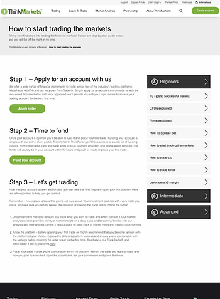
Pre-website redesign
Showcase of some screens from the ThinkMarkets website before the redesign


Lo-fi iterations and flows
We first iterated on the designs of the low-fidelity screens and then created journey flows.
The image presents the various flows starting from the education tab of the menu. It showcases low-fidelity wireframes for each menu item and a navigation preview for the education section


Regional needs
As our services span diverse regions globally, it was imperative to ensure our website's adaptability to cater to the unique needs of each area
Several factors were taken into account during the design process:
• Creating various menu structures for different regions
• Designing for additional markets/incorporating investing within the education section
• Adding specific pages tailored to the requirements of individual regions.

Hi Fidelity screen buildout
We designed over 200 screens
We provided Desktop, tablet and mobile screens to dev including behavioral notes on functionality of modules
Homepage
Note: Animation speed in prototypes is not accurate to actual speed as Figma limits the speed range
Desktop
Mobile
Instruments
Account types
Markets
Platforms
bottom of page